The 2021 Underground Music Showcase (UMS) in Denver made for a perfect opportunity to introduce Terrapin’s new brand position. I had been working on the new brand position and tagline for months and it was finally ready to share with the world: Flower to the People.
Working closely with the event founders at Two Parts, I organized a multi-faceted brand activation. Designing the flow of our 10x20’ tent space, music fans submitted their emails at the entrance and were rewarded with free access to a custom photo booth, snow cones with flavors inspired by flower strains, custom Terrapin x UMS stickers, and a daily t-shirt giveaway (exactly at 4:20pm, of course!).
Beyond the incredible music, the Terrapin tent was the most popular spot during the entire event. Check out the full details and phenomenal results here.
Role: Executive Creative Director
Logo Animation: Manuel Perez
Photography: Jeremiah Corder
When the decision was made to change Terrapin’s flower packaging from jars to bags, I pitched an entirely new approach for the brand: strain-specific flower packaging.
Challenge: The previous plastic jar packaging was very bland and relied on a tiny consumer label to list the strain for consumers. It didn’t stand out from other products on the shelf or cultivate any personal connection to the consumer. As a result, the packaging design for Terrapin’s primary product wasn’t engaging, memorable, or driving the purchase decision and brand loyalty in any way.
Approach: I started by doing a deep dive into the top 6 strains that Terrapin consistently produced. I researched each strain for their lineage, physical and mental effects, and the descriptions written by consumers on social and review platforms. In addition, I developed a communication hierarchy based on how consumers shopped for flower (dominance, weight, and strain). Using all of this data, I created designs that visualized the most prevalent strain attributes in creative ways that would bring the packaging to life.
Solution: From custom typography to illustrations, the personality and effects of each strain were cultivated into unique packaging. To keep the Terrapin brand at the forefront as well as establish a consistent treatment across each package, I used the geometry from the “wings” in the Terrapin logo to create top and bottom elements. This treatment worked to frame the strain-specific artwork, make the Terrapin “Flying T” logo more prominent, and clearly communicate the strain dominance (Indica, Sativa, or Hybrid) and the product weight.
Result: I pitched the initial designs to internal teams and the enthusiastic reaction was incredible. Immediately, the team began discussing how to better align the agricultural production to support this strain-specific packaging approach. This unique packaging was introduced when Terrapin launched in Missouri, making the brand launch in a new market truly exceptional. The consumer response was absolutely overwhelming.
Role: Creative Director
Photography: Jeremiah Corder
Cannabis concentrates is a rapidly growing category. Terrapin’s concentrate brand was in dire need of a brand position and visual identity so consumers could develop stronger brand affinity. The opportunity was not only apparent, but it was also necessary as the two-headed bear visual (below) was non-compliant in several states. Given the increased competition in the category and lack of compliance, creating a brand position with a compelling emotional connection and a memorably visual aesthetic was no longer a luxury.
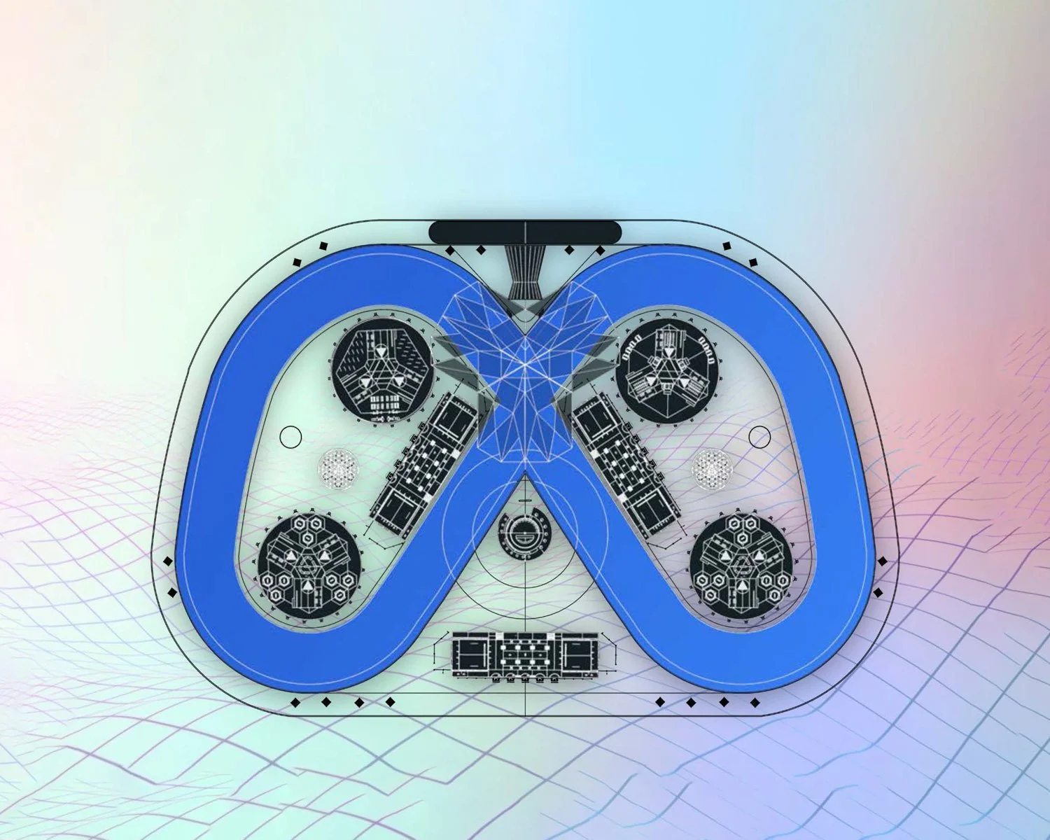
Distilling the core elements of the products, cannabis and the scientific process used to produce them, down to their essence became the center of the new brand position: Science & Flower. I expanded on the concept and the alchemical aura it evokes by creating a visual environment enhanced by a graphic library of sacred geometry. Working with a copywriter, a tagline was formed:
“SUPER. NATURAL. SCIENCE.”
This conveys the strength of the category (super), the plant behind the products (natural), and the process in which it’s made (science). The double entendre embedded in the new tagline, supernatural, builds on the mysticism. The tagline is further crystalized into an ownable call to action when used earlier in the consumer journey:
“HARNESS THE POWER OF SCIENCE & FLOWER”
Since its launch, the new creative direction and brand position has been expressed across new packaging, apparel, social platforms, billboards, and an entirely new way for consumers to connect with the brand. As a result, Double Bear became one of the top hottest brands in Michigan and beyond.
Check out the Double Bear case study here.
Role: Creative Director
Copywriting: Ned Connolly
Photography: Jeremiah Corder
As an avid snowboarder who grew up in the Bay Area, I cut my teeth (caught my edge?) riding in Lake Tahoe. This love of mountains, combined with a fondness of working with active lifestyle brands, ignited ideas for a passion project for one of Vail Resorts premiere destinations, Northstar.
I wanted to develop a fresh campaign concept that celebrated Northstar’s identity and distinctive offerings in the Tahoe area and in Vail’s portfolio. Starting with a thorough discovery phase, I combed through Northstar’s readily available brand guidelines. Extracting personality profiles, brand tonality, style guides, and previous campaign language, my whiteboard became the pinnacle of mountain resort obsession.
Crafting two approaches for spring season campaigns for Lake Tahoe’s only luxury resort, I designed Key Visuals, each with specific language that highlighted Northstar’s unique experiences. These creative directions were then used to guide designs for mobile and desktop landing pages, animated display ads, and storyboards for 30-second video spots.
Although this was a personal assignment, I believe I’ll reward myself with a trip to my old stomping grounds for further “brand research”.
Note: A campaign presentation deck can be found here.
With DTC subscription services continuing to gain momentum and popularity, Nature Made knew it would be smart to use their 40 years of vitamin science and research to launch a new, personalized brand. They brought this core idea to The Integer Group and charged us with forging a DTC brand from scratch. We happily took on the challenge.
Under my leadership, we created the brand name and visual brand identity, launched a unique approach to lifestyle photography that celebrated real people, and researched and developed a personalized quiz that curates custom vitamin and supplement combinations. This was a massive endeavor; I directed week-long photoshoots, collaborated closely with our development and UX/UI teams (coworkers and freelancers), and pitched Integer’s work and ideas to our clients with the support of our insight and strategy team.
With new packaging, website, quiz, and two social channels with enough content to last a full quarter, we launched the brand and entered the health and wellness subscription space beautifully.
Role: Creative Director
Pharmavite’s largest brand is a household name in health & wellness: Nature Made vitamins. With over 40 years of science and research that helped establish Nature Made as a leader in the vitamin industry, it was time to refresh the brand to appeal to an emerging target audience.
Incorporating a new packaging design, a completely new visual brand identity was developed. A refreshed look included more energetic lifestyle photography, a brighter color palette, hand-drawn illustrations, and product photography that celebrated the new packaging. In short, my team and I led a complete brand overhaul to help Nature Made pivot towards a younger consumer base.
I worked with UI/UX and insight and strategy teams to rebuild and redesign the Nature Made website from the ground up, bringing the brand to life and ensuring accessibility and compatibility across all devices. For an eCommerce website of this scale, it was a massive endeavor and sorely needed for the brand which was running on a very outdated platform and visual design.
To accompany their core digital property, we developed a new social strategy and delivered an impressive range of social assets that infused their social channels with much-needed energy and growth.
Role: Creative Director
Crocs needed a new way to tell product stories that would elevate their content from the industry-standard static marketing messages. I pitched an entirely new stream of digital content and directed the project: product videos communicating the inspiration behind the designs, told by the product designers themselves. Shot and directed to be conversational, approachable, and most of all, fun. The result was rich content communicating trends, style, and wearing occasions that spoke naturally with consumers rather than at them.
Leading an outsourced video team and internal product designers, this new type of content came together exceptionally well and the result was overwhelmingly positive by consumers across the board via social interaction and campaign engagement. By the end of the year, a total of 18 Product Inspiration Videos were launched, culminating in a very fun Blooper reel.
Role: Director, Digital Design
2016 Communicator Award winners:
Award of Excellence - The Classic Clog
Award of Excellence - Star Wars Chewbacca Clog
Award of Distinction - Wedge Collection
Aligning with the highly anticipated launch of the new Minions movie, Crocs released their unique licensed Minions kids' clog. I designed a full digital campaign strategy to capture the inertia and excitement of the Minions movie and heighten the narrative arc of the product launch.
As the movie launch date approached, Minions invaded the Crocs digital experience, spanning from an extensive email campaign to a full site takeover - they were everywhere. A product reveal video was shot to capture the first impressions of the new product from the Minion's biggest fans. The kids went bananas - almost as much as the creative team at Universal NBC who were more than impressed with the site takeover and one-of-a-kind video, elevating the Crocs' partnership with Universal to Minion heights.
Leading a full video team, I created and directed all lifestyle video content for the Crocs 2015 Fall/Holiday and 2016 Spring/Summer seasons. Shot on location in LA over two weeks, I worked alongside two other teams, each shooting lifestyle and lay-down stills respectively. Maximizing locations, we collaborated in very cozy quarters to capture as much content as possible with limited resources.
The result was engaging and relatable video vignettes that were shown in retail locations across the globe, in an OOH campaign, and across all digital properties. The video project expanded product and brand awareness through entirely new content for Crocs.
Role: Director, Digital Design
After a full year of shooting 18 product design videos, we were left with plenty of evidence of hard work AND fun (editing room gold, AKA: outtakes). There is nothing more real or hilarious than directing people who are trying their best to keep a straight face while saying a very verbose product name… only to break into laughter mid-take. Every. Time.
This was an end-of-the-year 'thank you' to everyone who helped bring this new Crocs video content to life.
Role: Director, Digital Design
May the 4th is a religious day for devout Star Wars fans. The year 2015 was especially important to the legions of fans as the movie launch date approached, with Disney/Lucas celebrating May the 4th, I'm your Father's Day, Force Friday, and an embargo date when all licensed products were approved to hit the shelves. Consumer fans were inundated with thematic products. For Crocs, 2015 really did awaken the Force with the timed launch of new Star Wars-themed merchandise.
"A mindful approach, to rise above a saturated market it takes."
While the authenticity of this Yoda quote is questionable, I channeled his wisdom to elevate this campaign. We designed a narrative arc to celebrate the launch of a full Star Wars product collection, creating relevant touchpoints online and in social for each Star Wars holiday, building the story and momentum until the embargo date arrived and Crocs launched a very unique collectible: limited edition Chewbacca clogs.
In addition to full campaign creative leadership, I directed a Star Wars product video with the on-screen talent acting more like a super-fan than a co-pilot and wearing a homage to her favorite Wookie with her attire and footwear. Combined with a teaser campaign and full site takeover, the Wookie clogs sold out in less time than it takes to make the Kessel Run (12 parsecs, for those playing at home).
May the 4th be with you.
Surprise and delight are elegant design elements that make an experience especially memorable. This was the approach when creating the mobile Spring Lookbook for Crocs.
To accompany their popular annual Spring Direct Mail catalog, I designed a mobile lookbook that offered a fun and different way to browse through the Crocs spring collection. With an identified audience of busy moms who value their time, I designed the lookbook to be easy for her to browse, offering elements of surprise and delight via product collections that featured a touch-friendly spinning carousel of curated products.
2014 Mobile Web Award winner:
Best Mobile Website Design
For the launch of the new brand initiative "Find your ____" campaign, I led the creative direction for a Back to School mobile microsite. From a custom UX/UI design to full content creation, we created a new shopping experience where consumers could browse a curated school-focused product collection, shopping by style or color, shifting the e-commerce experience to use the visual language of the brand campaign to lead the consumer journey.
Collaborating with Denver-based motion graphics agency, Wyatt, I drafted storyboards and led the animation direction, bringing the paint splash campaign to life in a 30-second spot that was shown on the big screen in Times Square.